The IEEE Visualization conference is just wrapping up, and this year I had the distinct pleasure of helping Bernice Rogowitz and Georges Grinstein in bringing back the Vis Lies event. It’s my favorite activity at vis that was disappointingly missing the past two years. I’m happy to say that it is back and as much fun as ever.
For those who haven’t had the distinct pleasure of attending, Vis Lies is a meeting where we share examples of lying and confusing with visualization. It’s a great way to learn the pitfalls of visual information display as well as learn the general principles behind good design. But mostly it is hilarious to see spectacular failures. It’s the visualization academic’s equivalent of watching someone getting smacked in the crotch.
I don’t have an accurate count of how many people attended, but we estimate it was around 90 or so. That’s pretty good for an 8:00pm meeting after a long day of lectures, workshops, tutorials, and other events. It’s probably about the same number of people that attended the SciRUN party that was running at the same time, and unlike us they had beer.
As always, the format ran with the organizers presenting a few examples and then opening up the forum for audience members. The audience was a little shy this year, but we did manage to coax Drew Skau, Russ Taylor, Soren Knudsen, and Mark Edgar to come up with some examples, and thanks to all of you. Kudos also goes to Francesca Samsel, who planned to present but was prevented by technical snafus.
Below are some examples from the event. Many are mine and others are those I collected from other presenters. I haven’t included everything, and if I’ve missed something you presented that I left out, drop me a note.
Legal Consequences
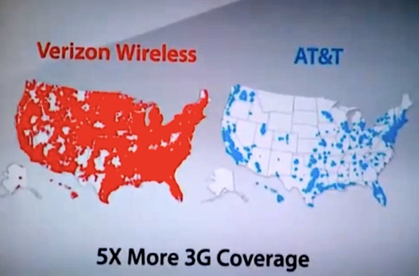
Georges, or was it Bernice?, opened up the event with a warning how a visualization lie can have real consequences, even to those creating the visualization. Recently, AT&T sued Verizon over the “There’s a map for that” ads. At the heart of the lawsuit is AT&T’s claim that Verizon’s infographic of 3G coverage suggests that AT&T has no coverage over most of the country when in fact that most of this area is still covered by a 2G network.
Verizon’s infographic could easily have suggested varying levels of coverage instead of implying the network does not exist. But then, commercials are not well known for fair comparisons. (AT&T later dropped the lawsuit after a federal judge declined a restraining order against Verizon.)
Bubble Bath
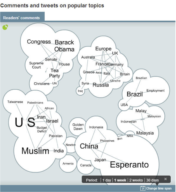
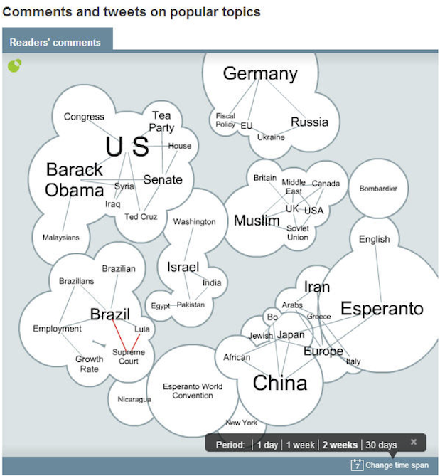
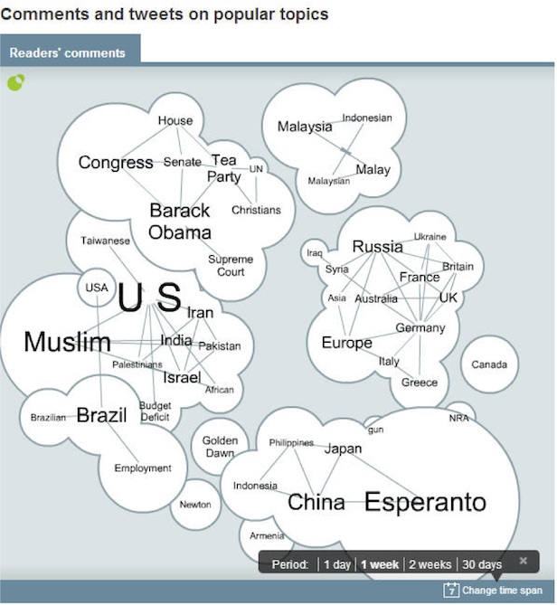
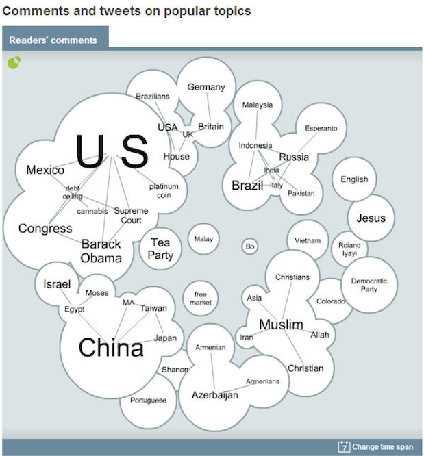
Bernice, or was it I?, came across this visualization from the Economist showing popular topics based on twitter traffic. The images shown here were captured on October 7, 2013. This visualization of bubbles is showing two things at once. The size of the bubbles (and associated labels) represent the relative popularity of the topics. The location of the bubbles represents the relationship between the topics (presumably measured by coincident mentions of the topics). Closely related topics are merged into a single bumpy shape.
All this is a straightforward and intuitive way to represent the frequency and relationships of topics. But consider what happens when you hit the refresh button and the visualization is regenerated. As we look from the first image to the second image, we see that the visualization has completely changed. “Germany” has become huge whereas “Muslim” has shrunk and completely broken its strong bond to “US.” “Esperanto” is inexplicably related to “China” but for some reason not well related to the “Esperanto World Convention.” (Who knew a fabricated language could be tweeted more times than it’s actually used?)
Further generations of this visualization provide even more conflicting results. This final image is our favorite. It shows the “Tea Party” is disjoint from the “US,” which I guess is better than the “Democratic Party” on the complete opposite side of the chart (next to “Jesus,” of course). And for some reason in the middle there is a little topic named “Bo” by its lonesome. I guess Bo knows nothing. (That’s right, I just made a pointless reference to a 25-year-old TV commercial.)
All this inconsistency demonstrates that the important aspects of this visualization, size and position, have only a tenuous relationship with the data. There is nothing about this visualization we can trust. After all, just hit refresh and it will tell you something different.
WTF?
Drew Skau was our first volunteer from the audience to present. He provided us with many entertaining examples from his WTF Visualizations site. I’m not going to post every visualization presented, although I certainly encourage you to explore wtfviz.net for yourself. That said, one of our favorites was this info cow.
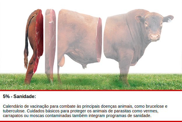
This visualization is equal parts offensive and delicious. None of us could figure out what information this is supposed to convey. (This comes from Brazil and no one spoke Portuguese. At least no one speaking up.) I hope it’s demonstrating a 100% meet cow. Too much of a cow is inedible bones and guts.
Grid of Confusion
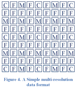
At every Vis Lies I, or is it Georges?, like to introduce at least one lie that I have been personally involved with because that’s only fair. At right is the original figure that was part of a paper I was involved with a few years ago. The image (supposedly) shows the layout of a 2D array arranged to be loaded as a hierarchy of detail levels. The C’s, M’s, and F’s represent data at coarse, medium, and fine levels, respectively. When you look at this grid, it appears to be a random assortment of letters in a grid. However, there actually is a pattern to the data here even if it is invisible. Take a moment to see if you can figure it out.
There are two main problems with this representation. The first problem is the use of the C, F, and M symbols. Although we can certainly recognize any one of them when we look individually, taken as a group they are too similar to group into regions. The fact that they are all capital letters of about the same size does not help. The second problem is that each letter is encapsulated in its own box, creating a grid of double lines. These lines draw attention away from the real data (supposedly represented by the letters) with clutter and visual vibrations. Every time I look at this I see gray blobs from a Hermann grid-like illusion.
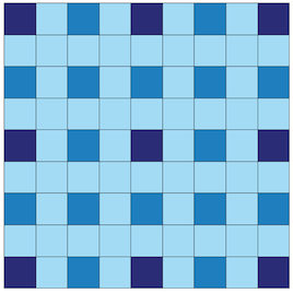
Here is a much better representation of the same data with dark, medium, and light colors representing the coarse, medium, and fine labels, respectively. The colors make the pattern instantly recognizable and the muted lines no longer interfere. I have intentionally used colors of similar hues to respect that these are the same data at different fidelity.
The (Destructive) Power of Rainbows
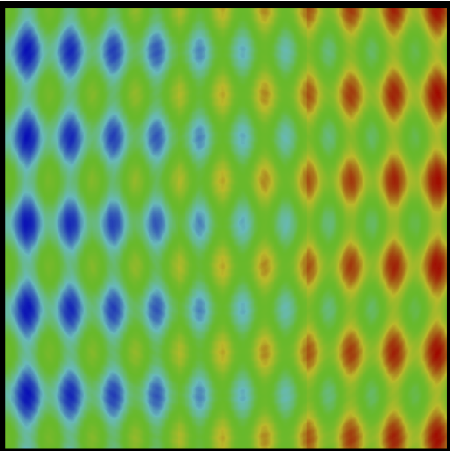
Russ Taylor came up and discussed some of the dangers of the rainbow color map. At right is an image of a 2D data field encoded with the rainbow color map. There are numerous problems with the rainbow color map, a big part of which is that it appears uneven which in turn hides features. This particular field has five salient features. Can you find them? Try to name them before reading on.
First, you may have noticed that there is an overall slant to the data. The data on the left is lower than the data on the right. Second, there are downward pockets and raised ridges throughout the slope. These ridges are uniform (although you might have thought the ones in the middle are more shallow). Third, there is a pattern of ripples that radiate from the center of the image. This ripple center is not quite symmetrical with the bumps. Fourth, there is a vertical step about 3/4 of the way through the data. You can probably see it OK through the red and yellow areas but not as well through the green. Fifth, there is another vertical step about 1/3 of the way through the data. This one is very hard to see.
Gorgeous Falls
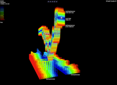
Bernice, or was it I?, found this interesting visualization of the stock plummet after a spoofed tweet of an injury of US President Obama. (Click the link to see the full animated version.) We had a good time with this because there is just so much wrong with it.
Where to start? Once again we have the problematic rainbow color map, but since the colors don’t seem to signify anything maybe that doesn’t matter. The labeling is completely unclear and there are no axes to show the scale of the data. If there were, they would show that the graph has a significant offset. The Dow Jones for that day dropped from around 14,700 to around 14,570 and then back. That had serious consequences for investors, but really amounted to only a 1% drop in overall value, which you cannot possibly tell from this visualization. To make matters worse, the chart is pointlessly rendered in a 3D space and viewed at such a ridiculous angle as to make understanding the chart impossible. Finally, the animation of the chart means that you have to compare things that are constantly shifting.
Ultimately, there are so many lies in this visualization that they seem to cancel each other out to make a completely unreadable display of data. Obviously the animation is created completely for entertainment, which leads Yahoo! Finance to describe this as “gorgeous.” Everyone is entitled to their own opinion, but personally it just reminds me of Mario Kart.

Comp-area
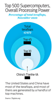
Here is a chart that I, or is it Georges?, have taken from the April 2011 issue of IEEE Spectrum. As a technical trade magazine, I hold spectrum to a higher standard than, say, a chart in Entertainment Weekly (but perhaps not quite as high as a chart in an xkcd cartoon). This chart is a group of circles encompassing each other representing parts of a whole. The outer darkest blue circle represents the aggregate computing power of every supercomputer on the Top500 list circa late 2010. The successively smaller and lighter circles represent the power of the aggregate top 45, aggregate 10, and top supercomputers, respectively.
I have redacted the labels that give the percentage that each circle represents as a whole. (The large dark blue circle of course represents 100%.) Can you guess what these labels should be. In particular, what percentage does the small light circle representing the Tianhe-1A represent? 25%? 15%? 20%?
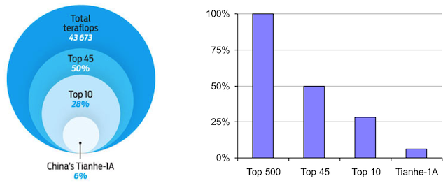
Did you guess anywhere near 6%? I wouldn’t (unless I guessed the trick). The problem is that people are pretty good at judging relative lengths but pretty poor at judging relative areas. Thus, the circles on the left look relatively large whereas the bar chart on the right better demonstrates the relative values of each proportion. (Georges, or was it Bernice?, called me, or was it Georges?, out that my bar chart is also misleading. Granted, if you are judging the relative areas of the bars, that is principally true. But if you are judging the relative lengths the bar chart is accurate. Are the bars so wide as to encourage the viewer to judge areas instead of width? I’ll leave it as an exercise to the reader to perform the objective perceptual study.)
A Nation Divided
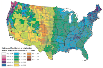
One good example of bad visualization that has gotten a bit of notoriety is this map, originally demonstrated in Robert Kosara’s eagereyes blog. Looking at this map, we see that there is a striking rise in evapotranspiration (loss of rain water through evaporation) right at the center of the country. We can see a vertical line from the Dakotas to Texas where the west side has a much larger evapotranspiration rate than the east.
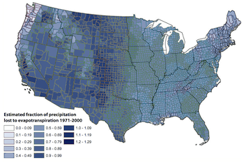
Or does it? If we look more closely at the values these colors represent, we see that some of the colors look an awful lot alike, such as those two greens that are almost identical, whereas other colors are very different, like the green and the yellow-green next to it. Thus, this sudden change is completely artificial. If we replace the original colors with more perceptually even colors, like this saturation map, we see this line go away and that there is a smooth transition throughout.
It should be noted that this color map is not a true rainbow color map in that the colors chosen are not perfectly spaced by hue, which may be exaggerating the non-uniformity. It does go a long way, though, to demonstrate the dangers of careless colors.
Until Next Year
There were plenty more good examples presented, but this post is running long and I’m already two weeks late in writing this up.
Thanks once again to Bernice and Georges for resurrecting Vis Lies. And a special thanks to Bernice for going through herculean efforts to get these optical illusion coloring books for participants (and especially for giving me one).
