I recently had the pleasure to host another session of VisLies. As an early demonstration of lying with visualization, I presented these 2 graphs taken from data provided by the CDC for US states.1

The first plot seems to suggest that more vaccinations cause more people to die. The second plot, built from the same source data, suggests that more vaccinations prevent deaths. They cannot both be right.
The difference is easily explained. The graph on the left measures data in absolute numbers whereas the graph on the right measures data per capita. Measuring data with absolute numbers is problematic. By simple proportions, we would expect a state with a larger population to have more vaccinations and more deaths. The difference in population between the most populous state (California) and least populous (Wyoming) is over 65 times, which overrides any effect from differences in vaccination. The fact that the left graph also takes a cumulative death toll, most of which happened before the vaccine was even available, skews the results even more.
The Paper
But that’s not what I really want to talk about in this blog. Soon after I presented the above images, Pat Crossno pointed out a paper she had found recently with a similar theme. The paper is titled Increases in COVID-19 are unrelated to levels of vaccination across 68 countries and 2947 counties in the United States and was published in the European Journal of Epidemiology. In particular, the article has the image shown at right.
What is strange about this plot is that it seems to show the opposite of the plot I presented earlier. It shows the vaccination rate correlated with a higher infection rate. Unlike the poor visualization example I gave at the beginning at this blog, the values on both axes are given per capita, so the difference is not explained by a correlation with population.
So what gives? Let’s dive deeper.
Replication
As a first step, let’s replicate what was done in the paper. Fortunately, the paper is using a public data source that is freely available to everyone. It is using the Our World in Data COVID-19 data. The paper takes data from August 28, 2021 to September 3, 2021.
To replicate these results, I pulled the data on October 30, 2021. I also filtered my data to the week between August 28 to September 3. It should be noted that because I pulled the data at a later date than was done for the paper, it contains more entries in the week we are analyzing because there can be a long delay for the reporting. Because it contains more complete data, I will use it here.2

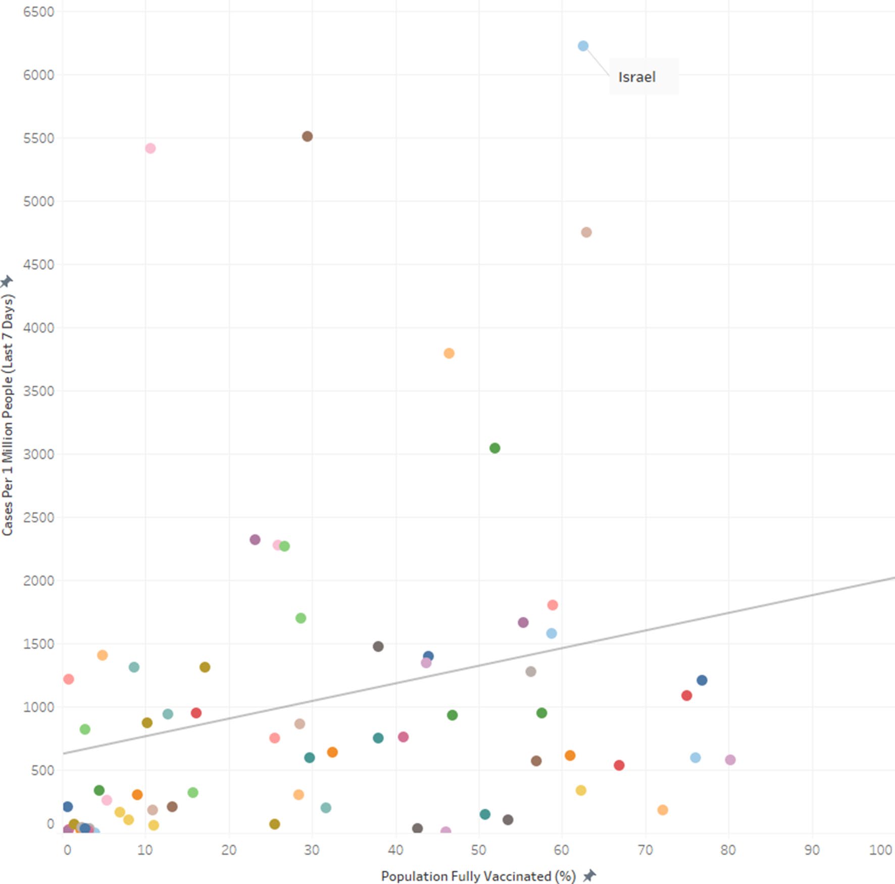
So, after filtering the data down to valid data for the week in question, we get this plot at right. The basic characteristics of these two plots are the same. They both show a linear regression in the positive direction. Israel, labeled in each plot, stands as a particular outlier in both plots.
The plot I replicated does have more points, and many of the points have larger values. In the plot here, the Israel outlier is joined by another measurement (it happens to be Mongolia). This difference is likely due to taking the data at a later time. Some of the positive tests taken in this week were reported after the paper was written. Nevertheless, the new data does not significantly skew the outcome.
Alternate Hypothesis
The paper concludes from this graph that increased vaccination does not reduce and in fact may increase infection rates. I propose an alternate hypothesis: the correlation we are seeing is more influenced by the amount of tests given than the amount of infections that actually occur.
This hypothesis is based on the observation that the cases in the data cover only positive tests. A person who gets COVID-19 but is not tested will not be counted in this database. It does not take a genius to surmise that more COVID-19 tests can lead to more measured “COVID-19 cases”.

Fortunately, this same data set contains information about the number of tests administered. The plot at right shows the correlation. Although there are other factors at play here, we can see that there is some correlation between testing and positive tests.
The second part of the hypothesis is the idea that a the number of vaccines administered is correlated with the number of tests given. This would make sense as a country with the wherewithal and desire to vaccinate a high proportion of people are also those that are more willing and able to administer more tests.

We can easily verify this in the data. Here is a plot demonstrating the correlation between the number of people vaccinated and the number of tests administered. Apart from a few outliers, countries that vaccinate more tend to test more.
So with this new evidence, the relationship between vaccination and the actual infection rate is less clear. Much of the case rate can be explained by simple testing rate.
Conclusion
To be fair, the paper is not using this data to make claims about vaccine efficacy (as I was claiming at the beginning of this blog). Rather, the paper is attempting to correlate vaccines to the infection rate of the virus. These are not the same thing.
Although counterintuitive, it is conceivable that the infection rate might not be negatively correlated with vaccination rate even with an effective vaccine. Perhaps a vaccine breakthrough case is likely to spread to more people because the symptoms tend to be more mild and therefore the person is likely to spend more time in public while infective.3 Furthermore, vaccinated individuals might be inclined to relax mask and social distancing precautions (which tends to be encouraged by current recommendations and policies).
But I contend in this blog post that the data used for this study does not actually demonstrate a correlation between vaccination and infection (or lack thereof). Rather, any correlation in the data is between vaccination rates and COVID-19 detection rates, which is really driven by the correlation between the number of vaccines given and the number of tests done. Of course, neither have I demonstrated any correlation between vaccines and infection. Ultimately, this data is too incomplete to draw such conclusions.
The data for these two plots come from the CDC’s COVID Data Tracker. The data is a combination of two tables: COVID-19 Vaccinations in the United States and United States COVID-19 Cases, Deaths, and Laboratory Testing, both pulled on October 24, 2021. The specific data used in the tables are here and here. The Python code to generate the plots is here. ↩︎
As stated, the data used in this blog can be pulled from this link. Python code to generate the plot is here. ↩︎
Never trust a sentence that uses the word “perhaps.” “Perhaps” is a qualifier that absolves the speaker from providing any evidence for the statement made. ↩︎